This article may contain affiliate links that Yahoo and/or the publisher may receive a commission from if you buy a product or service through those links.
Choosing the right paint color for your home office is about more than just aesthetics — the color you pick can dramatically impact the functionality and productivity of the space. From bright whites to soothing blues and energetic yellows, endless choices can make it hard to know where to start.
Luckily, interior designers know a thing or two about picking the perfect paint hues, so I asked a handful of them to weigh in on the best office wall colors. Surprisingly, they struggled to agree on one color, with several competing for the top spot.
That’s likely because when choosing a color for a living room or a shade for a bathroom, the intent is different as these are seen as communal spaces. Offices, however, tend to be more personal and designed to spark creativity and productivity. As such, designers say they see a far wider range of colors for home offices than other rooms. Ultimately, blending functionality and beauty is key when choosing the perfect home office paint color for your taste and lifestyle.
“Your home office can be a place that reflects your style and personality … when choosing a shade for your office space, it really comes down to who you are, how you like to work, and your goals for your workspace,” says Gideon Mendelson, founder and creative director at Mendelson Group.
So, what is the best overall paint choice for home offices? Here’s what several designers had to say.
The Best Paint Color for Home Offices
While there wasn’t one clear winner for the best home office paint color, two tied for first place: warm greige and dark blue. As for specific paint choices, designers recommended Sherwin-Williams Agreeable Gray (SW 7029) and Benjamin Moore Hale Navy (HC-154).

Greige is an excellent choice for those who prefer a neutral palette, and designers love to use it in home offices because of its simplicity, warmth, and versatility.
“Soft gray is so versatile, neutral, calming, and adaptable, which is so important when you are setting up a space that encourages focus and creativity,” says Bryonie Brooks, founder of BBH Life, a global architectural design company. “It offers a peaceful feeling without being sterile or flat and helps if you work long hours.”
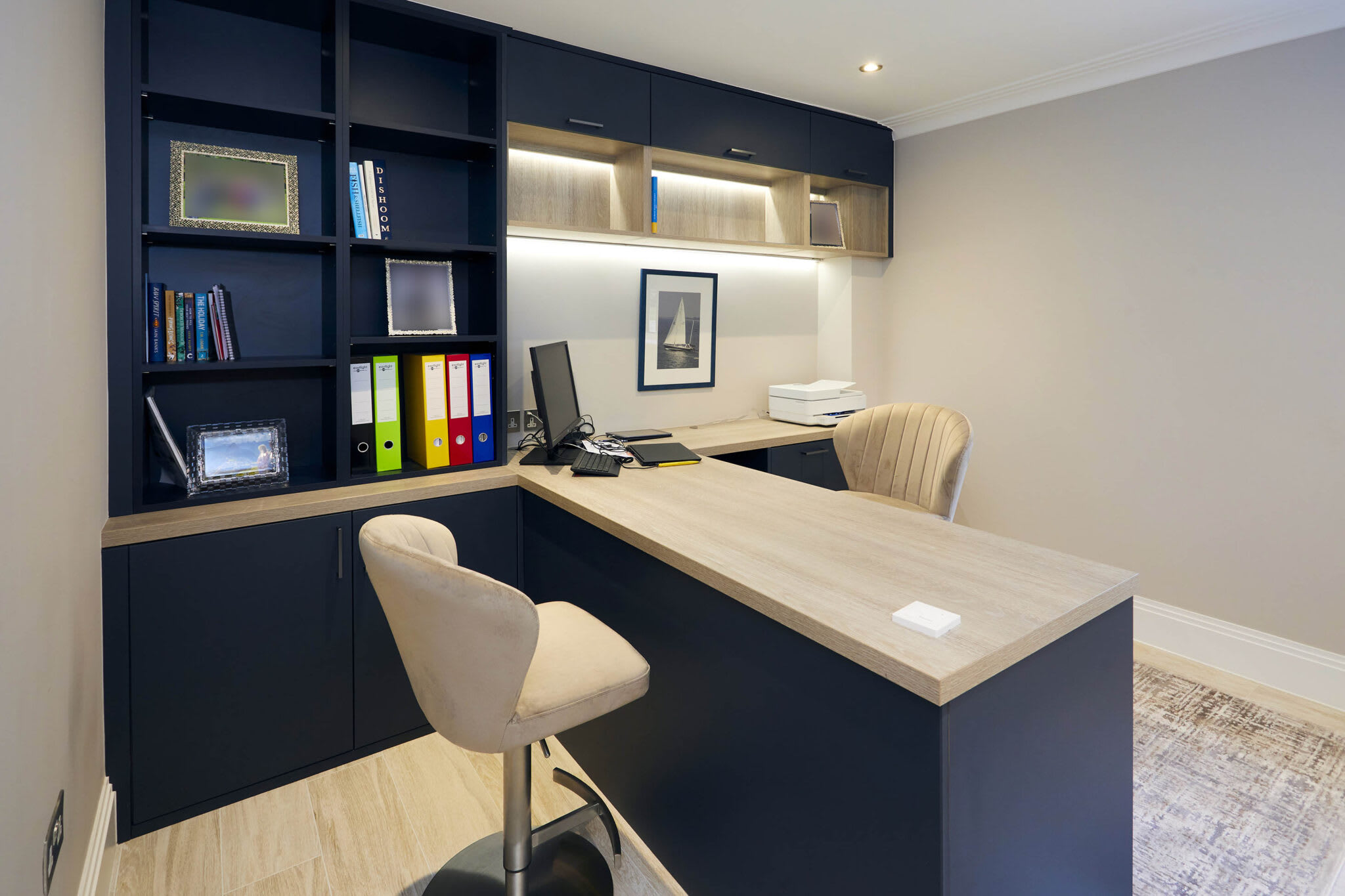
On the other hand, dark blues work well for creating moody and elegant spaces that can promote focus. Design pros also love using these darker shades to color drench small offices or studies for a cozier, more defined space.
“With more people working from home than ever before, I think it’s extremely important to feel some division between home and work,” Julia Newman, founder and principal designer of Julia Adele Design, says of color drenching. “By painting the space in a different technique than the rest of the home, it feels like a separation.”

Credit: Design: Apartment Therapy Credit: Design: Apartment Therapy
Other Home Office Paint Colors Designers Love
Outside of greige and dark blue, hues like off-whites, grays, greens, blues, and warm tones such as muted pink and terracotta won designers’ overwhelming favor as home office paint colors. Here are a few specific expert-approved shades.

Warm White
Warm white is a timeless classic that works well in any area of the home, including offices. Among designers, warm off-white shades closely followed greige and dark blue in popularity, thanks to their ability to make spaces feel larger and brighter. Plus, a simple shade of white on the walls can provide a blank canvas for furniture and decor to shine.
“I love to outfit an office with personal details and touches when it comes to accessories, so I usually keep the paint colors neutral so that my client’s artifacts stand out. I love whites and beiges for an office — particularly Benjamin Moore Simply White or Benjamin Moore Feather Down,” says Alexis Elley, founder and principal designer of Textures Interior Design.

Dark Green
Like dark blue, designers love moody shades of green for home offices if you want to create an inspiring and inviting space. Depending on the shade, deep green can act as a neutral, particularly paired with more earthy hues. Julia Hamer, project architect at Melichar Architects, points to Sherwin-Williams Ripe Olive (SW 6209) as her top pick, while Katie Siegel of Rumor Designs suggests Sherwin-Williams Jasper (SW 6216).

Charcoal Gray
A few designers also ranked medium shades of charcoal gray among their top home office paint colors. These sophisticated shades give any home office a moody, yet professional feel. Plus, they easily coordinate with other colors and decor in all styles. Paloma Contreras of Paloma Contreras Interior Design often turns to Farrow & Ball Downpipe (No.26) specifically.

Yellow or Orange
If you use your home office for creative pursuits, a bright and energizing color like yellow or orange may better fit your needs. Luis Carmona, interior designer and owner of VERDE Interior Design, suggests bold shades like Porsche Speed Yellow, Pablo Honey, or Bada Bing by Backdrop. Whether you stick to an accent wall or go all-out and color drench the space, these warm hues will surely add some cheery energy to your home office space.

Soft Pink
Soft pinks can also be a great paint choice for home offices — just aim to avoid light, powder pinks if you don’t want to feel like you’ve stepped into a nursery or child’s bedroom. Instead, opt for a warm, muted pink with earthy undertones for a more mature look. Maggie Lewis, cofounder of DAMA Interiors, suggests Farrow & Ball Setting Plaster (No.231).

Muted Terracotta
Similarly, according to designers, muted shades of terracotta or brick can also bring warmth and energy to an office while still feeling grounded. Experts point to Benjamin Moore Fading Twilight (1258) and Sherwin-Williams Cavern Clay (SW 7701) as top choices in this palette.
The Best Home Office Color Palettes
Before you start painting your walls, it’s important to establish an overall color palette for your space so you know what furniture and decor will look best. Whether you’re a fan of greige or dark blue, here are two color palette ideas for each shade, plus some designer tips for making them work in your home office.

Dark Blue with Warm Wood and Metallic Accents
Dark blue paired with neutral wood tones and metallic accents establishes a sophisticated and timeless color palette for a home office. “With darker blue colors, I like pairing them with neutral wood tones to create a balance of warm and cool,” says Rosanna Bassford, founder and principal designer of Memmo Interiors. “The darker blue color is grounding and makes spaces feel rich and elevated while the shades of brown wood tones bring in warmth.”
You can use silver and matte black accents for a more modern feel, too. Or, for a cozy, vintage look, try brushed gold or bronze.

Dark Blue with Light Wood and Soft Neutrals
For a softer aesthetic, try pairing Benjamin Moore’s Hale Navy with light wood and neutrals like off-white, greige, and light gray. Incorporate natural materials such as rattan, wicker, and plants to play up the bohemian feel.

Greige with Earthy Tones
Greige is a warm neutral that lends itself well to nearly any design style. However, experts favor two color palettes in particular for home offices. The first combines greige with earthy tones for a grounded, nature-inspired space, designed to inspire creativity and mental clarity. Think natural wood, greenery, warm whites, and soft browns. Add some black accents (like cabinet handles) for a touch of contrast.

Greige with Light Neutrals and Natural Wood
Second, Brooks says her favorite way to use greige in home offices is to pair it with other light neutrals and natural wood tones. The wood helps introduce warmth and texture, making it feel cozy and inviting.
“This palette creates a clean, minimalistic, and calming environment, perfect for those who want a serene, uncluttered workspace that fosters concentration,” she says.
This simple neutral palette is ideal for small spaces where natural light is limited, since it reflects light well and helps to visually open up the space. Finish off the look with some gold or bronze accents for a truly serene and productive workspace.
Further Reading
We Tested (and Rated!) All the Living Room Seating at Burrow to Determine the Best for Every Space and Need
Everything You’ve Ever Wanted To Know About Article’s DTC Furniture
We Asked 8 Pro Travelers What They Never Pack in Their Carry-On, and Here’s What They Said
Sign up for Apartment Therapy’s Daily email newsletter to receive our favorite posts, tours, products, and shopping guides in your inbox.
link


